How the designers of Atlantis The Royal created a sense of intimacy despite its scale
13 February, 2023

The image of Beyonce raised high above the water as fireworks light up the sky around her during the grand reveal of Atlantis The Royal will go down in Dubai history –— but it also highlighted one of the central themes of the new hotel’s design. H2O.
As the name, a reference to the mythical underwater kingdom, implies, water is integral to Atlantis resorts. At Dubai’s original Atlantis, The Palm, this manifests as underwater suites, expansive aquariums and a record-breaking water park.
At the new Atlantis The Royal, which will begin welcoming its first official guests this week, the aim was to explore “the idea of connecting with water” in novel ways, explains Terry McGinnity, executive design director of GA Design, the company tasked with creating the interiors for the 795-room property.
“When you talk about the DNA of Atlantis The Royal, you talk more about the precious nature of water in this environment. We looked at ways we could express that,” he says.
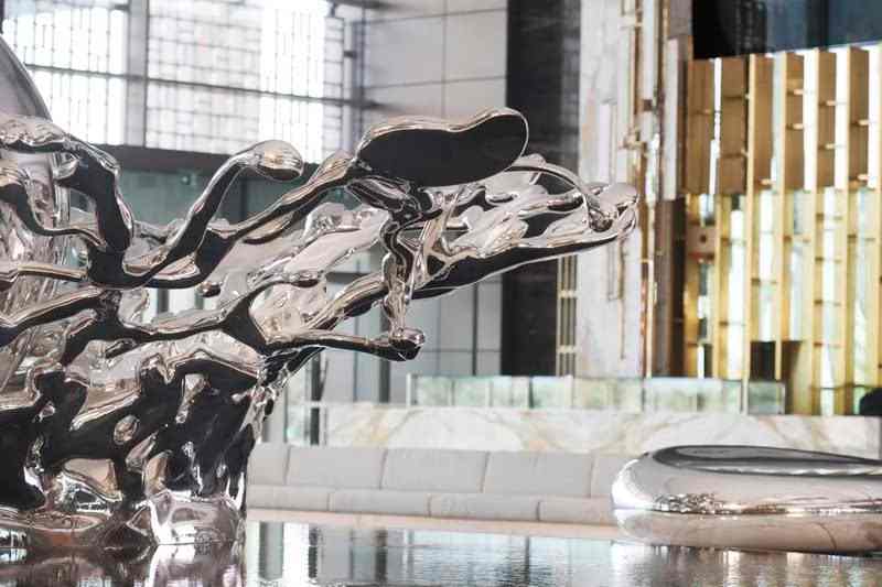
The concept is explored most emphatically during the arrival experience. Stepping into the hotel, guests are flanked by two walls of water, unexpectedly interspersed with bursts of fire. The lobby’s centrepiece is an 11.5-metre-tall silver sculpture, Droplets, which is meant to represent the first drop of rain in a dry desert. On either side, there are aquariums that are designed to house jelly fish, with digital backgrounds that transform them into a new breed of technologically driven nature-centric art.
Meanwhile, floor to-ceiling glass at the far end of the lobby frames views of the sea, with the hotel’s piece de resistance in the foreground. Cascades of water flow down into Skyblaze, a 28-metre-high feature that combines water, fire bursts, lights and performative music. This is the body of water that Beyonce traversed during the finale of her groundbreaking performance, before a platform lifted her majestically into the air.
But while water is at the essence of the hotel, it is the sheer scale of the property that defines its design. Its dominating silhouette has already become an integral part of Dubai’s skyline, as it sits brazenly on the outer crescent of Palm Jumeirah, adjacent to sister property, Atlantis, The Palm.
“We were asked to dream big on this project. To create something unique and iconic for Dubai — and when I look at it now, I’m amazed by the audacity of the whole undertaking,” says James von Klemperer, president and design principal of Kohn Pedersen Fox Associates, the architecture firm that brought the ambitious project to life.
Spanning about 40 hectares, Atlantis The Royal is 500 metres long and extends 43 storeys and 178 metres upwards. Its distinctive form consists of six towers shaped like a stack of individual blocks, connected from above by a 90-metre by 33-metre sky bridge.
It would be easy, with such numbers, for the interior of the property to feel cold and overwhelming. But the GA team has done a good job of humanising that scale. “It was about breaking it down into moments and journeys. That was really the whole story for us,” says McGinnity.
“Because you have to walk quite a distance from the reception to the last lift lobby, it was about creating moments on that journey that made it worthwhile continuing, and creating destinations within the whole layout.”
The property’s all-day dining restaurant, Gastronomy, is an interesting case in point. “That was a huge challenge,” says McGinnity. “It can sit 1,000 people, but we worked really hard to make sure it didn’t feel like it was just a sea of tables, but rather smaller restaurants within restaurants.
“It feels quite intimate. You can sit in a corner and feel quite comfortable and come back at night and sit over by the grill and it will feel different. All the way through, there were efforts like that, so you don’t feel dwarfed by the space.”
Despite its size, the illustrious overtones of its name and the spectacle of its grand reveal, the hotel is relatively pared back. This, says McGinnity, ties in with how perceptions of luxury are evolving in the hospitality sphere. “Luxury is really about space and time for people now, rather than the big accoutrements,” he says.
“We tried to pare it down a little bit, so it was really all about reflectivity and light and the outdoors — creating those moments where people felt like they could step back and take some time, and not always be on show.
“A lot of work was done in the gardens to create quiet moments and corners and layering. Inside, we tried to break it down so it feels more intimate, like you can get away from things.”
Rooms are defined by their clean lines and calming palettes, ensuring the design doesn’t detract from the main event – vistas of the open ocean on one side and, on the other, sweeping views across the sea, the Palm and the skyscrapers of Dubai Marina, framed by Burj Al Arab on one side and Ain Dubai on another.
“For us, luxury is actually more minimalist. What you touch and taste has to be top quality, but you are not overwhelmed with the unnecessary. We really love the idea that whatever’s there should be there for a reason and if you took it away, you’d miss it,” McGinnity explains.
“One of the things we always argue in the office is, you should be able to justify everything you put in there; there should be a logic to it. It’s got to be beautiful, but it must serve a purpose.”
That’s not to say there aren’t moments of good old-school Dubai bling — Graff amenities and gold-hued toothbrushes, razors and loofah brushes in the bathrooms, just to keep things regal.
Source: www.thenationalnews.com
